Spring 2022 / Logo Design
Project Outline
While being a co-founder of a new club at Rochester Institute of Technology (RIT), I created a logo for the club as well as its name. The club, Brick City Blades, inspires and encourages members of the RIT community to learn and build ice skating skills while being in a safe, fun, and inclusive environment. As a club, BCB more than just ice skating, it is a community of people dedicated to help others learn more about the sport of ice skating. One thing that makes us unique is that we are a club made up of only RIT students. This logo is currently being used as a main branding element on marketing, merchandise, social media, and other club affiliated elements for the club.

The Objective
Design a logo for a club of choice at RIT that speaks about the club. Create mockups for things that would be used in the club including the logo. Is the club identifiable without knowing anything about it just by its logo?
Research & Inspiration
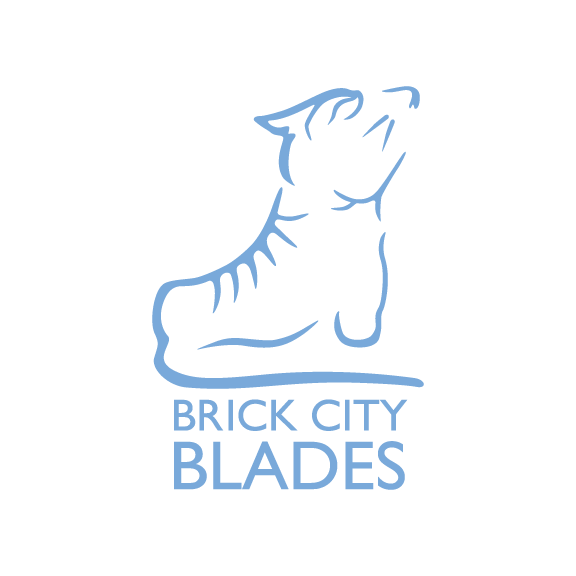
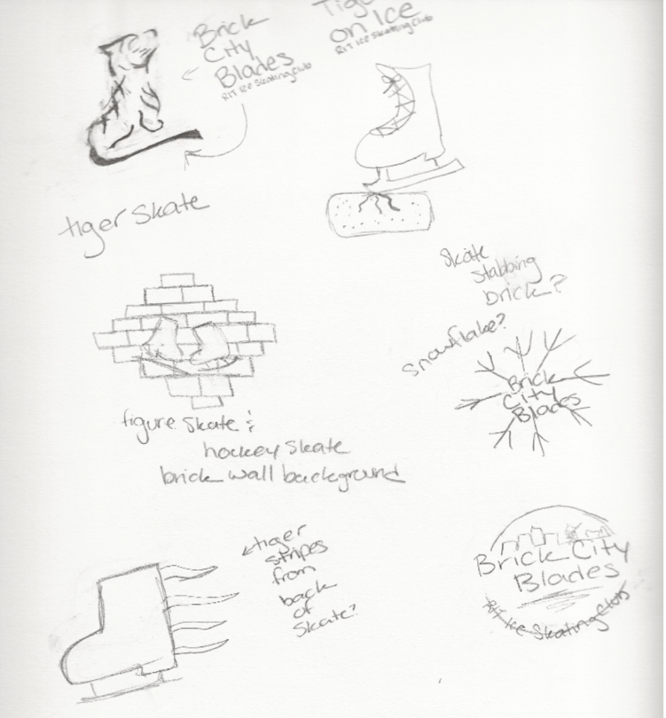
While it was important to have a skate in the logo, I wanted a sense of the RIT community within it as well. Using the gestalt principle, I created a logo that incorporates the traditional ice skate as well as a tiger, representing RIT and its tiger mascot. I chose the primary colors to be a light blue color, black and white while the secondary color is an orange color to correspond with the RIT orange. The typeface I chose is Futura because of the simplicity of the typeface contrasts with the detailed image logo itself, as well as it works well in smaller sizes.

Logo Sketches

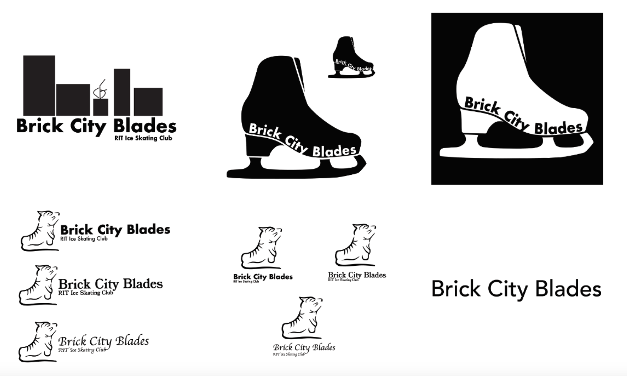

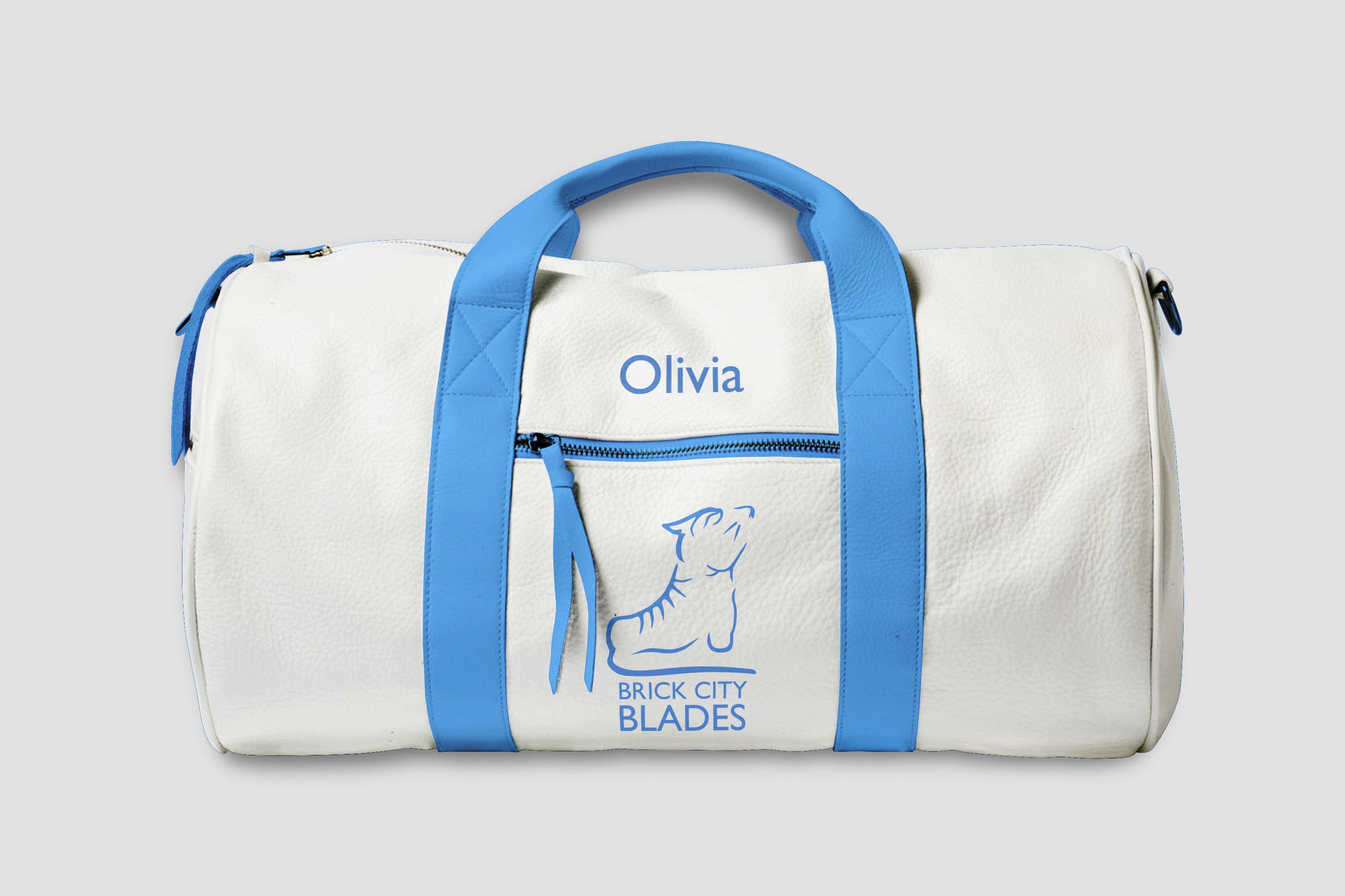
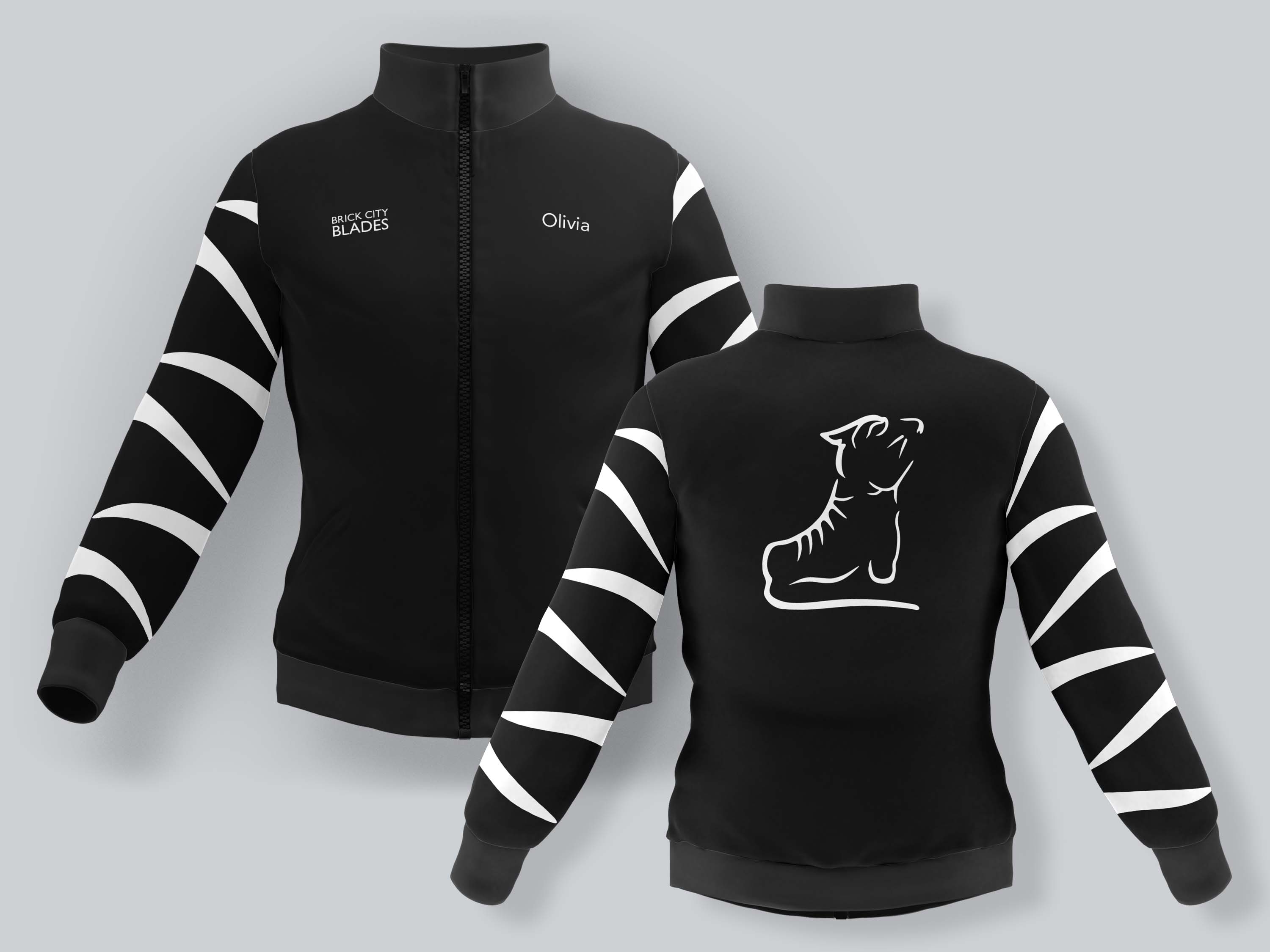
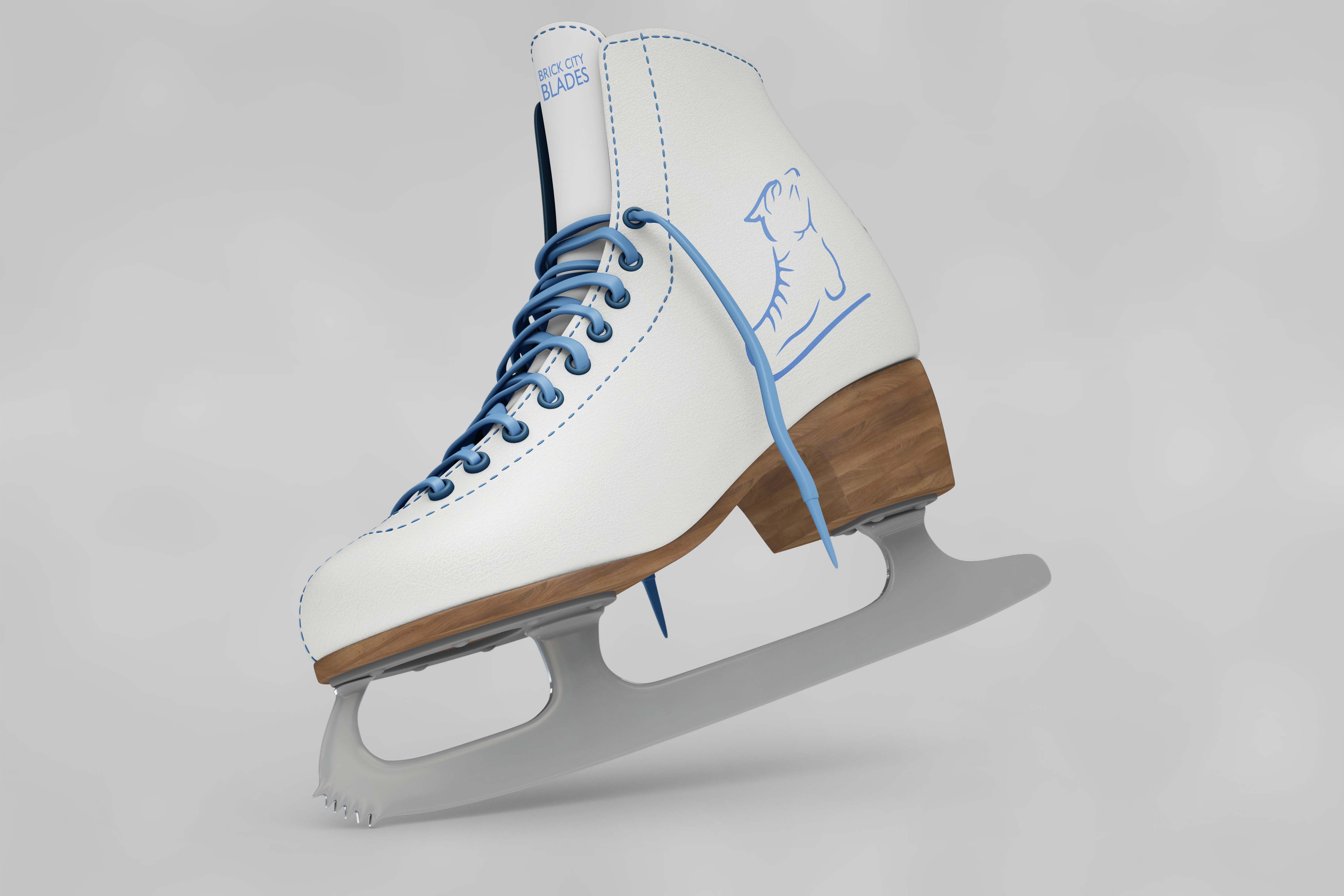
Mockups
*These mockups were made for the project, these products are not real products for the club. BCB merchandise and products are not shown here.*